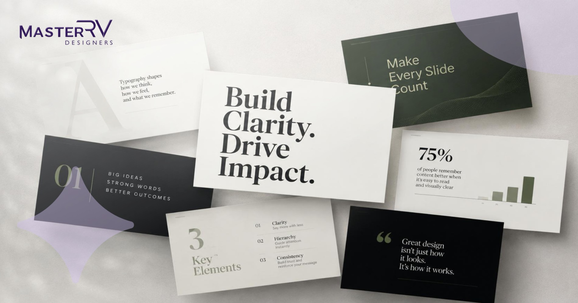
TL;DR
Typography in presentations is a commercial decision, not a personal one. Clarity and believability are produced by typography. Your message is improved by using the right fonts; it is diminished by using the wrong ones. The tried-and-true typographical guidelines for business presentations in front of an executive audience are presented in this article.
Introduction
Every successful presentation has a point at which the audience decides whether to believe you, not just the facts. When the first slide emerges, it’s important to assess your credibility, preparation, and professionalism. There is an important part of communications that receives little to no attention, even though many presenters work very hard with figures and substance. Specifically, typography.
Long before people focus on the substance of your presentation, typography is crucial to how it is perceived. Effective typography guarantees that the slides are readable, understandable, and memorable. Typography is one part of a broader presentation design system that combines hierarchy, visual structure, branding, and audience-focused communication. However, poor typography might cause some data to be misinterpreted, diminish trustworthiness, and even divert attention from the most crucial details. These factors are crucial for an event like a corporate presentation.
Using typography in presentations design has become increasingly complex as it has evolved. Presenters can better organise their content and direct the attention of the audience by using typography. Here are some helpful typographic tips to help presenters achieve these objectives.
Why Typography in Presentations Is a Leadership-Level Decision
For good reason, many leaders frequently assign creating slides to others. However, since typography in presentations is more than just aesthetics, executives should not assign understanding the fundamentals of making powerful slides. It all comes down to cognition, information hierarchy, and the speed at which a busy executive can understand what you’re trying to say. These principles are especially important when creating executive presentations, where every slide needs to support fast, informed decision-making.
The human brain processes visual information in under 13 milliseconds, according to a study from the Massachusetts Institute of Technology. Before they have ever seen a word on your slide, your audience has already formed an unconscious opinion on its credibility in the blink of an eye.
The audience checks out whether the typefaces are uneven, if the font size is too small to read from across the room, or if there are just too many fonts. It’s not a lack of interest in what you have to say. The reason for this is that your slides don’t convey that they were created with them in mind.
Slide typeface selection is not seen as an internship duty by those who receive this. They see it as a crucial component of communication.
Are You Prepared to Make Your Next Presentation Better?
Allow our experts to create a typographic system that is personalised to your brand, audience, and next high-stakes room.
The Best Fonts for PowerPoint That Senior Executives Actually Trust
For your presentation’s professional image, the best fonts for PowerPoint you choose can also have a significant impact. For a detailed comparison of font choices, see our guide to the best fonts for PowerPoint. It is crucial to realise that your audience will be impressed by your choice of clean, contemporary font. This particularly affected senior executives.
Sans-Serif for Business Decks: The Executive Standard
Sans-serif fonts are typically the best choice for usage in corporate PowerPoint presentations. Because they were created especially for usage on screens rather than in print, fonts like Calibri, Helvetica Neue, Inter, and Montserrat have been the standard while creating presentations in organisations.
The edges of sans-serif for business decks are unadorned. Because they project well even in highly lit conference rooms, they become more readable and clear even at a distance. You wouldn’t want to jeopardise your reputation as a CMO by giving a video conference presentation to a global team of executives over something as trivial as poor font legibility.
Do not use any fancy fonts, such as script or decorative styles, as they will make reading difficult. Making your presentation appear elegant shouldn’t be an issue. Communicating concepts and information is your goal.
Here are some things to think about while creating slide decks for board meetings and client settings:
- Headings: Helvetica Neue Bold and Montserrat Bold are bold, authoritative, and readable at huge sizes.
- Body text: Calibri/Inter Regular is smooth, neutral, and simple to read.
- Accent or call out: Montserrat SemiBold adds significance and intensity without being cluttered.
These aren’t strict guidelines; rather, the system is focused on what truly produces outcomes. At MasterRV Designers, every font selection we make for client decks is supported by the brand identity, context, and demographics.
Your Presentation Font Guide: Building a Hierarchy That Commands Attention
A well-designed presentation font guide typographic hierarchy makes it easier to understand information and helps people remember key points. Information is easier for people to understand when a visual style is created by employing varied font sizes for headlines, subtitles, and body text.
Font Hierarchy in Slide Design: Title, Body, and Accent
Guidelines for presentation typefaces are not very useful unless font hierarchy in slide design is taken into account. When making your presentations, everything is given equal weight if you don’t use the idea of typeface hierarchy, therefore nothing really sticks.
For more practical guidance on creating professional slides, explore these PowerPoint presentation design tips.
It’s quite simple to comprehend. Three different levels are required:
Level 1 — The Title: This is the framework for making decisions. At first glance, the executive must get what this PowerPoint is trying to convey. This level should convey a whole idea rather than just a description label, be the biggest visual component of the presentation, and use bold language. The label is Q2 Revenue Performance. The title “Q2 Revenue Grew 18% Despite Challenges in APAC” is ready for decision-making.
Level 2 — The Body: These are your arguments and proof. Your body will provide further justifications, statistics, and evidence for your title. In the presentation configuration, this section shouldn’t be smaller than 18 points. You will lose the interest of your audience if you use anything smaller.
Level 3 — The Accent or Callout: level uses pull quotes and highlights statistics and other metrics to emphasise your message. When used properly, this layer ensures no one can overlook the most crucial information.
Slides provide an automated flow pattern when there is clarity between these levels, which are distinguished by their sizes and weights.
Readable Font Size for Slides: The Numbers That Actually Matter
Even well-designed decks frequently fail in these situations. The readable font size for slides for the slide framework that MasterRV uses for each project is:
- Slide title – A minimum of 36–44 points
- Body content – Minimum 18–24 points
- Supporting callout or footnotes – Rarely used, no less than 14–16 points
- Never go below 14pt – if the text cannot fit at that minimum size, it must be rewritten.
These figures are not chosen at random. They rely on screen resolution, the required projection distance, and the reality that executives watching presentations in boardrooms are rarely within an arm’s length away from the screen. When projected, a presentation that appears proportionate on the laptop screen will instantly become unreadable text.
There is an additional aspect to your design considerations when you design for video calls, which are most presentations in today’s business world. The fonts and text that appear clear on your desktop may become blurry for the viewer when viewed on a phone because of compression artefacts and screen variances.
Slide Typography Tips That Separate High-Stakes Decks from Generic Ones
A slide typography tips effectiveness can often be impacted by little font decisions, which can determine whether it succeeds or fails. It makes a big difference to use fonts that are consistent, well spaced out, offer contrast, and create visual hierarchy. These details can also help prevent common presentation design mistakes that reduce readability and weaken the visual impact of business decks.
1. Limit Your Presentation to Two Font Families
The most helpful tip for typography on slides is to limit the number of fonts you use in your presentation to two. Your slides will become inconsistent if you utilise a variety of typefaces. This discrepancy could make your presentation seem unprofessional.
2. Create a Clear Font Hierarchy
Using fonts correctly in slide designs is crucial because it makes it easier for the audience to understand what is being presented. Subheadings should come after the title, followed by body text. This will make it easier for the audience to see the slides’ hierarchy.
3. Prioritize Readability Over Style
Typography should support, not impede, conveying a concept. Information can be more difficult to understand when fonts are overly elaborate, especially in a presentation context. Using fonts that are readable by all is standard procedure in professional presentations.
4. Use Adequate Font Sizes
Even the best content will always become meaningless if it is hard for viewers to read. It’s crucial to choose a font size that makes your slides readable from any location. Better comprehension and delivery ease are two advantages of this.
5. Emphasize Key Information Strategically
Not every text should be given the same amount of attention. To highlight key points, utilise boldface typefaces, contrasting colours, and space. The skill of emphasising involves highlighting only the important points. A polished presentation is typically the end outcome.
Font Pairing for Presentations: The Rules That Win Boardrooms
A presentation’s font selections make sense since they are based on contrast rather than conflict. The goal here is for the two typefaces to work well together, creating no tension.
For corporate presentations, using a heavy sans-serif for the headings and a different sans-serif for the text’s body may be the safest mix. These font pairing for presentations will fall into the same genre, either humanist or geometric.
What to avoid:
- Two serif fonts together — There is no way to tell them apart.
- A decorative headline font with a serif body — This combo doesn’t seem creative or consistent.
- Three or more typefaces on one slide — This is the most noticeable feature of a deck created by amateurs.
The top decks in the world, whether they are used for investments at Sequoia Capital, business pitches at McKinsey & Co., or keynote addresses at Apple Inc., only use two fonts per deck. This is not a limitation. An outstanding presentation is cohesive throughout fifty slides because of this.
More about creating presentation systems at the enterprise level: Google Fonts has an extensive collection of high-quality fonts that are free to download and use, along with recommended pairings.
Why Spacing and Weight Are as Important as the Font Itself
A certain typeface is not the focus of the presentation typography. Instead, it’s about the typeface’s breathing. A clear, confident-looking slide differs from a crowded, difficult-to-read one in terms of letter spacing, line height, and white space surrounding text blocks.
Practical suggestion: rather than lowering the font size, this slide has to be pruned if the text block takes up over 40% of the slide’s area. For body level texts, the ideal line height would be between 1.3 and 1.5.
Selecting the weight is also crucial. For body-level text, semi-bold is frequently a preferable option than bold because the latter would look excessively powerful at lesser sizes and interfere with the visual flow.
How to Apply These Principles Without Starting from Scratch
Executive leaders and their teams will also have to cope with the fact that while this set of rules is simple to understand, applying them correctly in PowerPoint and Google Slides needs expertise and a significant amount of effort. For organizations that need specialist support, a professional PowerPoint design agency can apply these principles consistently across an entire presentation system. Typography principles were not taken into consideration when designing the default slide creation program. Spacings and sizes are reset. Slides shift in spacing when they are copied. Other machines cannot render the brand fonts.
Because these experts weren’t hired for the job, this is one of the reasons why companies that invest in producing high-quality presentations engage outside designers rather than internal staff. Businesses evaluating external support can also learn how to choose the right PowerPoint design services based on quality, turnaround, strategy, branding, and data communication.
Credibility through typography, whether through font weight or size selection, is not an accident; it is done with the goal of communicating ideas through these kinds of visual designs and by the application of knowledge in both design and visual communication.
The upper left portion of a visual frame will undoubtedly be the first item that consumers encounter while scanning websites or apps, according to Nielsen Norman Group. As a result, the initial typographic element and your title must appear there.
The Presentation Design Solution Trusted by Fortune 500 Leaders
MasterRV Designers is an award-winning Mumbai-based presentation design company with more than ten years of experience, founded by its founder and CEO, Rohini Dabholkar. As a Fortune 500 company partner and ISO 9001:2015 Certified Company, we have completed over 45,000 projects in over 14 sectors. We help produce accurate and purposeful presentations that are ready for the boardroom.
Slide formatting, full deck presentations, visuals, branding, and even investor pitches are all included in our presentation design services. We guarantee that these services are provided in-house, within 8 to 24 hours, and at a reasonable cost, giving corporate clients access to high-end designs without having to hire an internal design staff.
In the world of luxury brands, such as jewellery, fashion, hotels, resorts, and even upscale real estate, typography plays an important role in showcasing one’s product range. The significance of brand identity in creating the ideal design for the client is taken into consideration while creating all of our opulent presentations.
Our luxury presentation designs guarantee that every deck has minimum text, worldwide relevance, and images consistent with the company’s identity. Every presentation is created with our wealthy clientele in mind, emphasising quality above everything else.
Renowned for High-Stakes Presentations by International Brands
MasterRV Designers produce powerful presentations that aid international brands in winning, influencing, and communicating.
Making Every Slide More Powerful Starts with Typography
One of the most crucial—and frequently disregarded—aspects of presentation design is typography. You can make complex material easily understandable and memorable by using appropriate fonts. While statistical data and visual aids might help effectively communicate your idea, only typography can ensure that those aspects are seen by your audience.
You can improve readability and provide a powerful manner to convey your main point by using appropriate typography in presentations design. Typography will be crucial to the process, whether you select the appropriate PowerPoint fonts or establish an efficient font hierarchy.
However, without the right design components, your presentation is unlikely to succeed, even if the material is thoroughly studied. For your ideas to be effectively communicated, all other design elements—aside from typography—must work well together.
FAQs
Why is typography in presentations important?
You may improve the way your messages are delivered and make your presentations easier to understand by using typography.
What are the best fonts for PowerPoint?
Examples include Calibre, Aptos, Arial, Helvetica, and Segoe UI.
Why use a presentation font guide?
A presentation typeface guide guarantees uniformity throughout.
What are the best slide typography tips?
Adequate spacing, font uniformity, and right hierarchy are all important.
How does font pairing for presentations work?
Combining different fonts to create more contrast is known as font pairing.
Why choose sans-serif for business decks?
They are readable and readable, and they appear tidy.
What is a readable font size for slides?
The font size range for corporate slides is 24 to 32 points.
Why is font hierarchy in slide design important?
Because it guides the viewer’s gaze throughout the presentation, font hierarchy is crucial.