TL;DR
The best fonts for PowerPoint in 2026 are crucial for clarity, engagement, and brand perception. Our top recommendations include Open Sans, Montserrat, Roboto, and Playfair Display. These fonts are modern, optimized for screens, and work great across devices. Remember that clarity and hierarchy are key. Additionally, use fonts that match audience expectations. By using the best fonts for PowerPoint in 2026, you are not only creating great-looking presentations but also communicating effectively.
Why Fonts Matter More Than Ever in 2026
Typography has come a long way from being used for visual presentation enhancement to being used for communication in presentation design.
In 2026, presentation slides designed using PowerPoint are being used in a variety of ways:
- On computers like laptops and desktops
- On tablets and mobile phones
- During remote meetings via Zoom, Teams, and Google Meet
- On websites
- On social media
By AI presentation tools
In 2026, audience attention spans are shorter than ever. In addition, presentation screens are more diverse than ever. Therefore, fonts must be crisp and modern for optimal presentation.
Fonts not only affect how easily your audience can read them but also affect how they feel about them. Whether you are presenting to investors, teaching a class, or presenting corporate earnings, fonts set the tone for how professional you are and how easily they can comprehend you.
At MasterRV Designers, we believe that font selection is more than just a presentation design element; it is a critical element in presentation design that must be considered for success in presentation communication.
Why Choosing the Right Font for PPT Is Critical in 2026
Screen Optimization for Multiple Devices
Presentations are no longer being viewed in large screens alone. They are being viewed on tablets and mobile phones too. Open Sans and Roboto fonts were designed for screens and work great in today’s presentation environment.
Insight: If your text is blurry or squished on smaller screens, your message is not communicated effectively.
Code of Professional Credibility
Typography is a subconscious factor in establishing credibility. Corporate stakeholders and investors demand structured, clean text, not decorative or overly styled fonts.
Helvetica, Montserrat, etc., convey the feeling of precision, clarity, and professionalism without overwhelming the viewer.
Brand Messaging & Identity
Typography is the silent ambassador of your brand’s personality:
- Clean sans-serif fonts convey ‘modern, minimalist’
- Elegant serif fonts convey ‘formal, authoritative’
- Bold display fonts convey ‘attention-driven, creative’
At MasterRV Designers, we perform brand audits on your brand identity before recommending the typography, so your PPT fonts align with your core messaging, whether it is ‘creative,’ ‘corporate,’ or ‘luxury.’
Integration with AI Design Tools
Most modern presentation software comes with AI capabilities. These AI tools automatically scale, space, and position content, but only if your typography is structured and clean.
Using AI-friendly fonts like ‘Roboto’ and ‘Lato’ will ensure your slides take the best advantage of AI-driven layout suggestions.
Accessibility & Comprehension
Good typography is not only aesthetically pleasing but also makes your content more accessible to people with visual disabilities, reducing the overall cognitive load, making it easier to comprehend your slides.
Ready to transform your PowerPoint into a high-impact presentation?
At MasterRV Designers, we combine strategic storytelling, modern typography, and AI-powered design to create slides that truly stand out.
Don’t settle for average, present with confidence and authority.
What Makes a Great PowerPoint Font in 2026? (5 Key Criteria)
To select the best font for your PowerPoint, you should consider the following five key criteria:
Cross-Device Readability
Does the font display clearly on all screens, whether large or small, like on smartphones?
Weight Variants for Hierarchy
Does the font offer multiple weights, i.e., light, regular, bold, etc., to help distinguish headings, subheadings, and body content?
Minimalist, Neutral Structure
Supports a wide variety of content and design styles.
High Legibility at Small Sizes
Essential for dense information slides.
Brand & Industry Alignment
Different fonts create distinct tones for the finance industry, tech world, education sector, or creative field.
10 Best Fonts for PowerPoint in 2026 (With Expanded Insights)
1. Open Sans
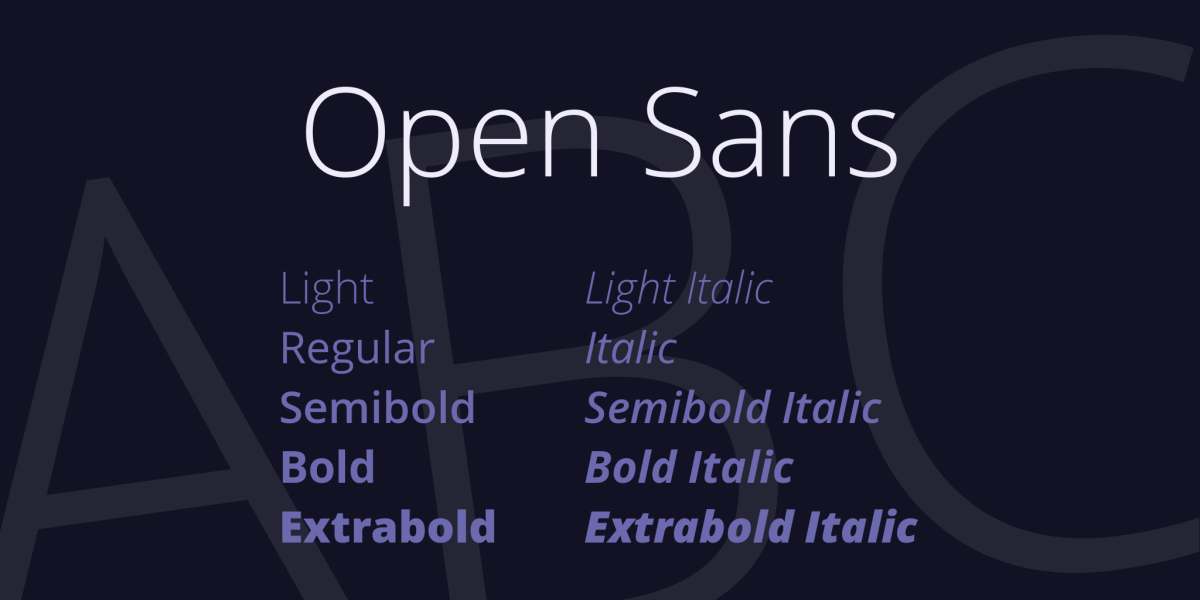
Open Sans is one of the most versatile fonts for PowerPoint presentations. The clean design and open letterforms of this free font ensure high legibility regardless of the screen size.
Why It Works:
- Neutral and professional aesthetic
- High legibility on digital screens
- Scales well for title and body text
Best for:Business reports, corporate training, webinars
MasterRV Insight:
At MasterRV, we often use Open Sans with other fonts as accents. It provides a good balance of neutrality and personality.
2. Lato
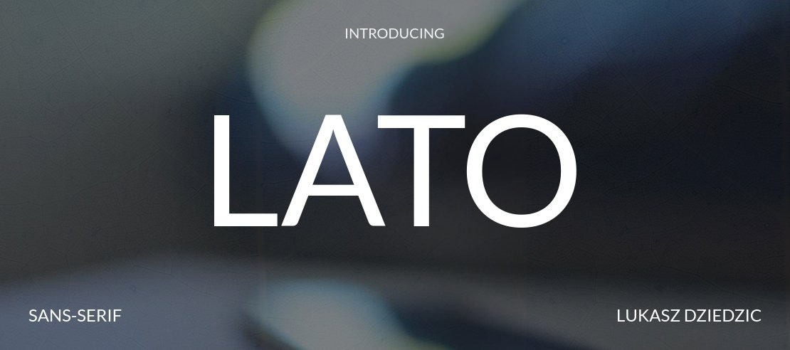
Lato is a professional yet friendly font. It adds a friendly tone to your PowerPoint slides.
Why It Works:
- Well-spaced lettering for high legibility
- Friendly yet crisp aesthetic
- Smooth curves for visual comfort
Best for: Marketing presentations, creative corporate slides
MasterRV Insight:
Lato is a great choice for your PowerPoint slides when you want to present information with credibility and personality.
3. Roboto
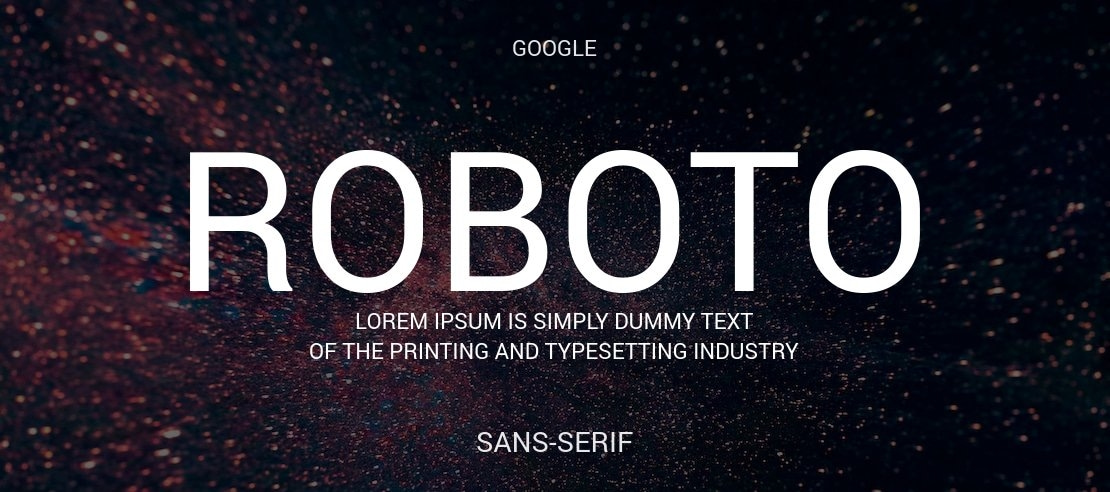
Roboto provides a modern, tech-inspired look. It’s a great choice for tech-related presentations.
Why It Works:
- High legibility on digital screens
- Geometric letterforms for a clean look
- Suits well with chart-based themes
Best for: Tech-related presentations, AI/SaaS-related product pitches
MasterRV Insight:
At MasterRV, we recommend using the Roboto font with a bold title font to create a visual statement for your data visualizations.
4. Montserrat

Use the Montserrat font for a bold and confident tone.
Why It Works:
- Strong visual appeal
- Modern design language
Best for: Pitch decks, new product launches
MasterRV Insight: Headline fonts such as Montserrat are great for setting expectations and grabbing immediate attention.
5. Helvetica
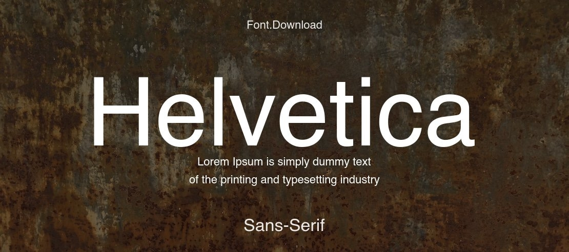
Helvetica is another classic font that is sure to get the job done in terms of legibility and professionalism in corporate settings.
Best for: Executive reports, legal presentations
MasterRV Insight: For situations where accuracy is paramount, Helvetica is the standard corporate font.
6. Arial

Arial is another simple and consistent font that is great for situations where font compatibility is necessary.
Best for: Internal meetings, older systems
MasterRV Insight: Arial is great for ensuring that the text is displayed properly in older systems and applications.
7. Georgia
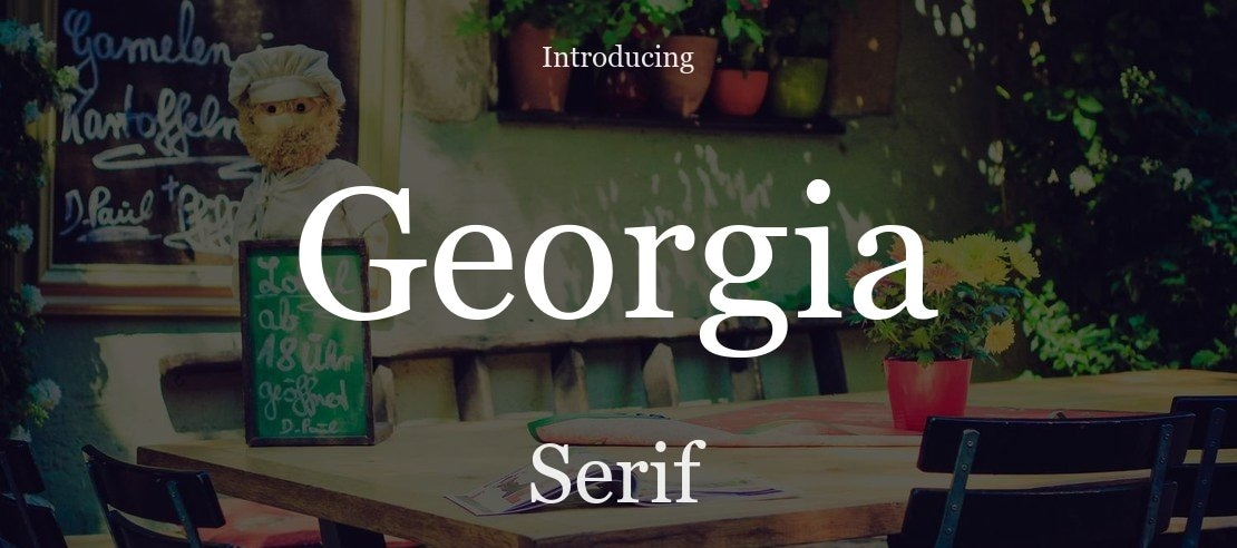
Georgia is another great font that is perfect for creating elegance in formal presentations that require handwriting in the body copy.
Best for: Educational, academic, legal slides
MasterRV Insight: Georgia is great for adding authority without looking dated.
8. Garamond
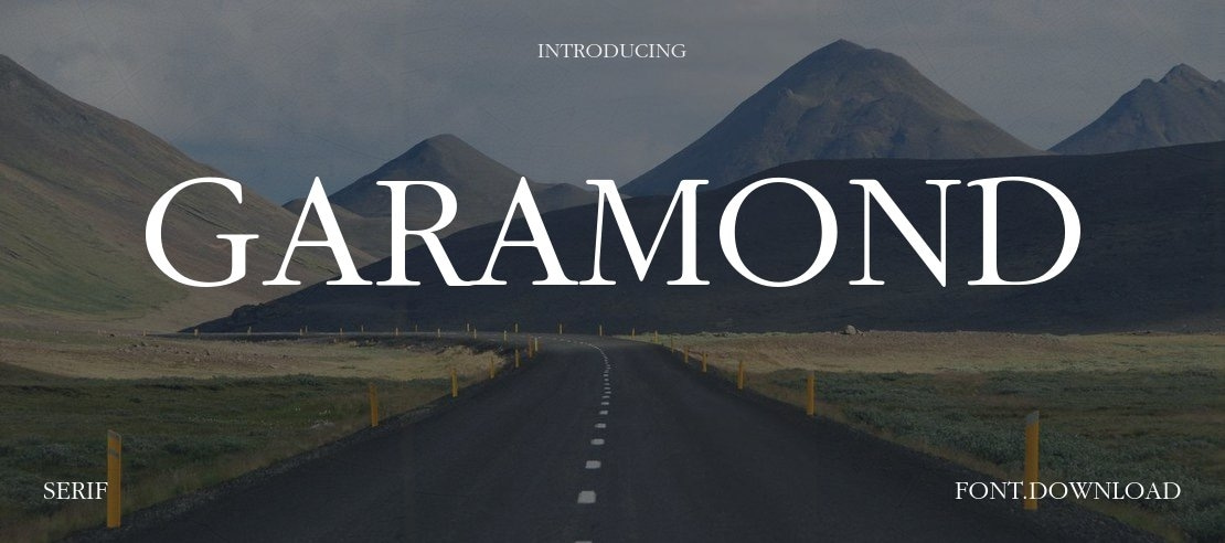
Garamond is another classic font that is perfect for adding elegance and readability in paragraphs and body copy in formal presentations.
Best for: Research presentations, investor reports
MasterRV Insight: Use this font for body copy and paragraphs, but avoid using it for data and numbers.
9. Bebas Neue

Bebas Neue is another great font that is perfect for adding bold and condensed styles to headlines and titles in presentations.
Best for: Creative, promotional, event presentations
MasterRV Insight: Use this font sparingly and only for titles and headings, and pair it with another clean font for body copy to avoid visual clutter.
10. Playfair Display

Playfair Display is another great font that is perfect for adding elegance and sophistication in presentations, especially in the fashion and luxury industry.
Best for: Fashion, luxury brands, artistic presentations
MasterRV Insight: Use this font sparingly and only for titles and headings, and pair it with another clean font for body copy to avoid visual clutter.
2026 Typography Trends in Presentation Design
Typography trends for 2026 are characterized by:
- Clean minimalist dominance of sans-serif fonts
- High contrast layouts dominated by bold font usage
- Use of AI-generated slide structures
- Increased white spaces for relief
- Accessibility-focused design
- Use of serif fonts for professional use
Presentations are no longer about aesthetics; they are about being readable and evoking emotions.
8 Expert Tips for Choosing PowerPoint Fonts in 2026
Stick to 2-3 Fonts Only
Using too many fonts makes a presentation look messy.
Use Font Weight to Organize Your Fonts
Bold – Titles | Medium – Subtitles | Regular – Body
Avoid Using Decorative Fonts for Body
Decorative fonts are distracting.
Use High Contrast
Make sure that the text stands out from the background.
Test Your Fonts Across Multiple Devices
Test your slides on a laptop, tablet, and phone.
Prioritize Readability Over Aesthetics
If it is not readable, it does not matter how it looks.
Fonts Must Match Your Brand Tone
Professional, friendly, bold, elegant – choose a font that represents your brand.
Adhere to Accessibility Guidelines
Using large font sizes helps visually challenged users.
The Benefits of Using Great Fonts for Presentation Design
Choosing the best font for PowerPoint doesn’t just enhance the appearance of your slides—it offers several strategic advantages. This section will explore why focusing on fonts for presentation design is essential:
- Improved Readability: Clear fonts make your slides easier to read, even from the back of the room. This is especially important for PPT fonts that will be viewed on smaller devices like tablets or phones.
- Enhanced Visual Appeal: The best fonts for PPT help create a visually cohesive and aesthetically pleasing design, drawing your audience’s attention where it’s needed most.
- Branding: Fonts contribute to the personality of your presentation. When you need something formal or more casual, choosing the best font for PowerPoint can help reflect your brand’s identity and message.
- Increased Engagement: A good PPT font style can help keep your audience engaged by reducing distractions caused by hard-to-read text or overcomplicated designs. When your text is easy to read and visually appealing, people are more likely to stay focused.
Final Expert Takeaway
Typography is not just about design, it’s about communication.
The Best Fonts for PowerPoint in 2026:
- Enhance the readability of your presentation.
- Help you take advantage of the latest AI-powered layout tools.
- Help you connect with your audience.
- Are optimized for viewing on any device.
If you want your PowerPoint presentation to not only look good but also function better, then font selection is a crucial part of the presentation. For the best in bespoke design, combining the expertise of a typographer with the latest in brand strategy and AI-powered design tools,
MasterRV Designers can help you create a presentation that will leave a lasting impression.
Your ideas deserve more than basic slides.
Let MasterRV Designers craft a visually stunning, brand-aligned presentation that captures attention and drives results.
From font selection to complete slide redesign, we handle everything.
FAQs
What is the most professional font for PowerPoint in 2026?
The most professional font is Open Sans and Montserrat.
How many fonts should I use in a single PowerPoint Presentation?
You should use a maximum of 2-3 fonts.
Do I use serif fonts in PowerPoint?
Yes, serif fonts such as Georgia and Playfair work well.
What font size is recommended for PPT?
Headings: 32–44 pt
Body Text: 20–24 pt
Captions: 14–18 pt
Are decorative fonts bad for presentations?
Yes, decorative fonts should be avoided in the body text of a presentation because they will decrease the readability of the text. They will distract the audience from the actual information.
Which fonts are the best for a pitch deck?
The fonts Montserrat for the title and Lato or Open Sans for the body text are the most suitable for a pitch deck.
How do I choose fonts for brand alignment?
The fonts chosen should map the personality of the brand. If the brand is formal, then the fonts should be formal. If the brand is modern or creative, then the fonts should be the same.