TL;DR
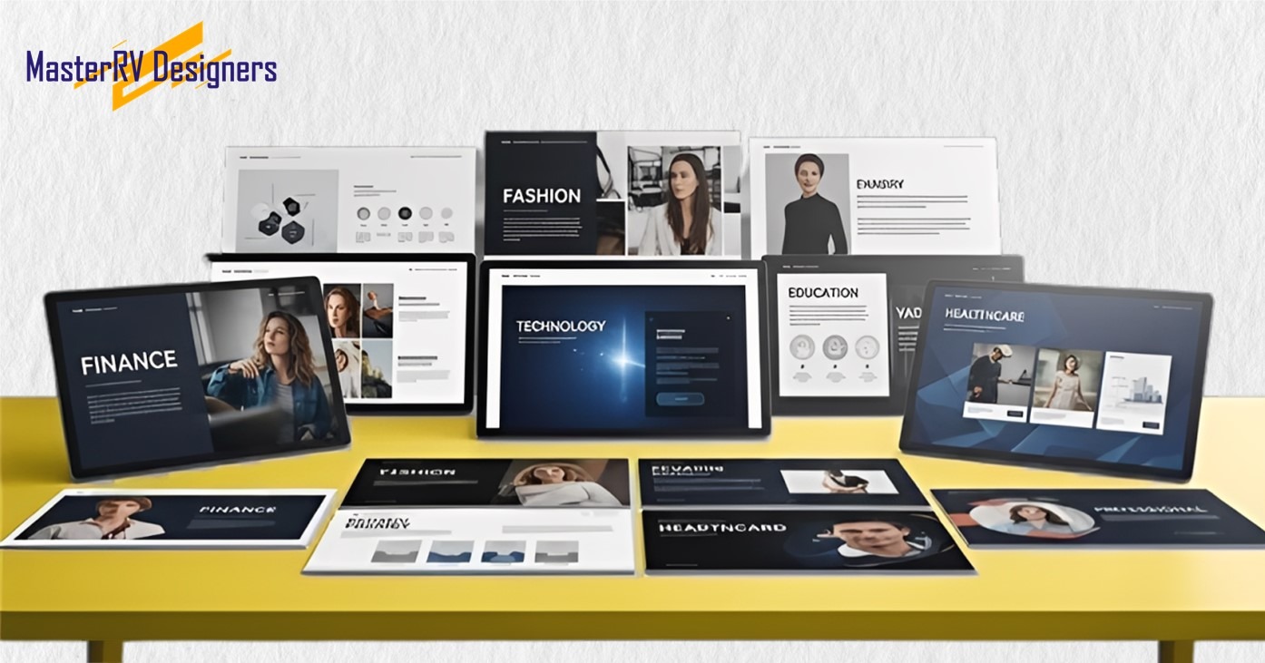
Generic presentations don’t usually work in all fields. Each field has its own needs: tech needs clear data, healthcare needs layouts based on evidence, fashion needs bold visuals, real estate needs photography and ROI, FMCG needs energy and insights, automotive needs sleek dark designs, and green energy needs openness. All great presentations have a clear story, a strong visual hierarchy, accurate data, and consistent branding. MasterRV Designers has more than nine years of experience in many different fields. They make presentations that grab people’s attention and get results.
In business communication, a “one size fits all” approach doesn’t work very often. The best presentations are the ones that use the language, priorities, and expectations of a certain industry. When you pitch to tech investors, give a quarterly review in healthcare, or show off a new line of clothing, the way your slides look and are set up should show the unique culture of your audience.
For more than nine years, MasterRV Designers has been making presentations for people in fourteen different fields. In this guide, we share design principles that are specific to your field to help you communicate more clearly, with more authority, and with more power.
Why design that is specific to an industry is important
Each field has its own way of seeing things. People who work in finance want accuracy, a lot of data, and a limited range of colors. Fashion executives like bold images, white space, and elegant typography. Healthcare audiences want visuals that are accurate, well-organized, and based on evidence.
When your presentation doesn’t match what your audience expects to see, it creates a subtle but strong feeling of disconnect. On the other hand, a well-tailored deck shows that you are competent, pay attention to details, and know a lot about the subject. It gives you credibility before you say anything.
Tips for Presenting in Different Fields
1. Technology

Presentations about technology need to strike a balance between being new and being clear. Most of the time, your audience, whether they are investors, partners, or clients, is analytical and data-driven.
- Use simple, clean layouts with lots of empty space.
- Use data visualizations like flow charts, architecture maps, and performance graphs.
- Pick a modern sans-serif font and a color scheme based on blues, grays, and whites.
- Show off the features of your product with annotated screenshots or short demo videos.
- Start with the problem, then show how your solution makes sense as a next step.
Don’t make things messy. People think that simplicity means sophistication in technology presentations.
2. Healthcare & Pharmaceuticals
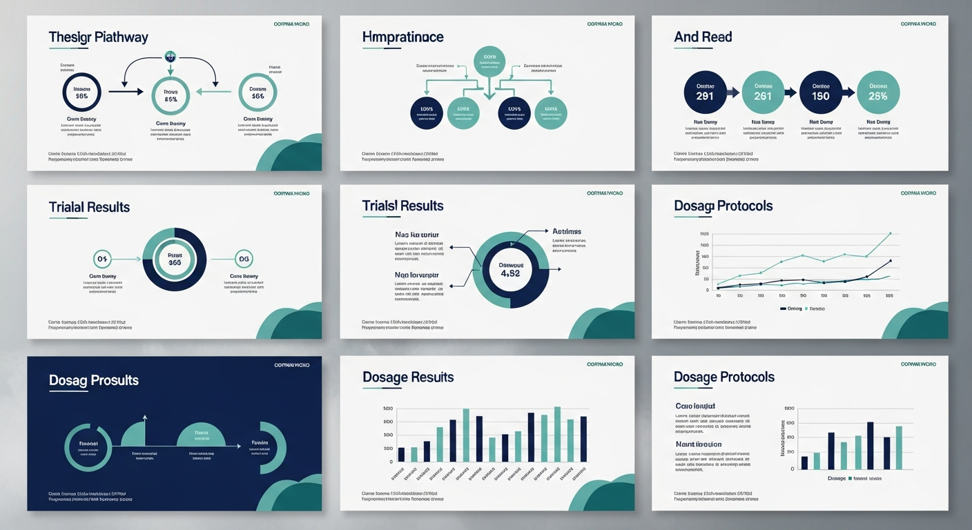
Credibility is very important in healthcare. Presentations must convey complicated scientific or clinical information with complete accuracy and professionalism.
- Make sure it’s easy to read by using big font sizes and high contrast.
- Every claim should be backed up by properly cited data, clinical references, or regulatory proof.
- To make complicated pathways, dosage protocols, or trial results easier to understand, use structured infographics.
- Stick to a simple color scheme: navy, teal, and white are all good choices.
- Don’t use decorative design elements that could make people think the science isn’t very strict.
Every slide should have a reason for being there. In healthcare, substance always comes before style.
3. Fashion & Luxury
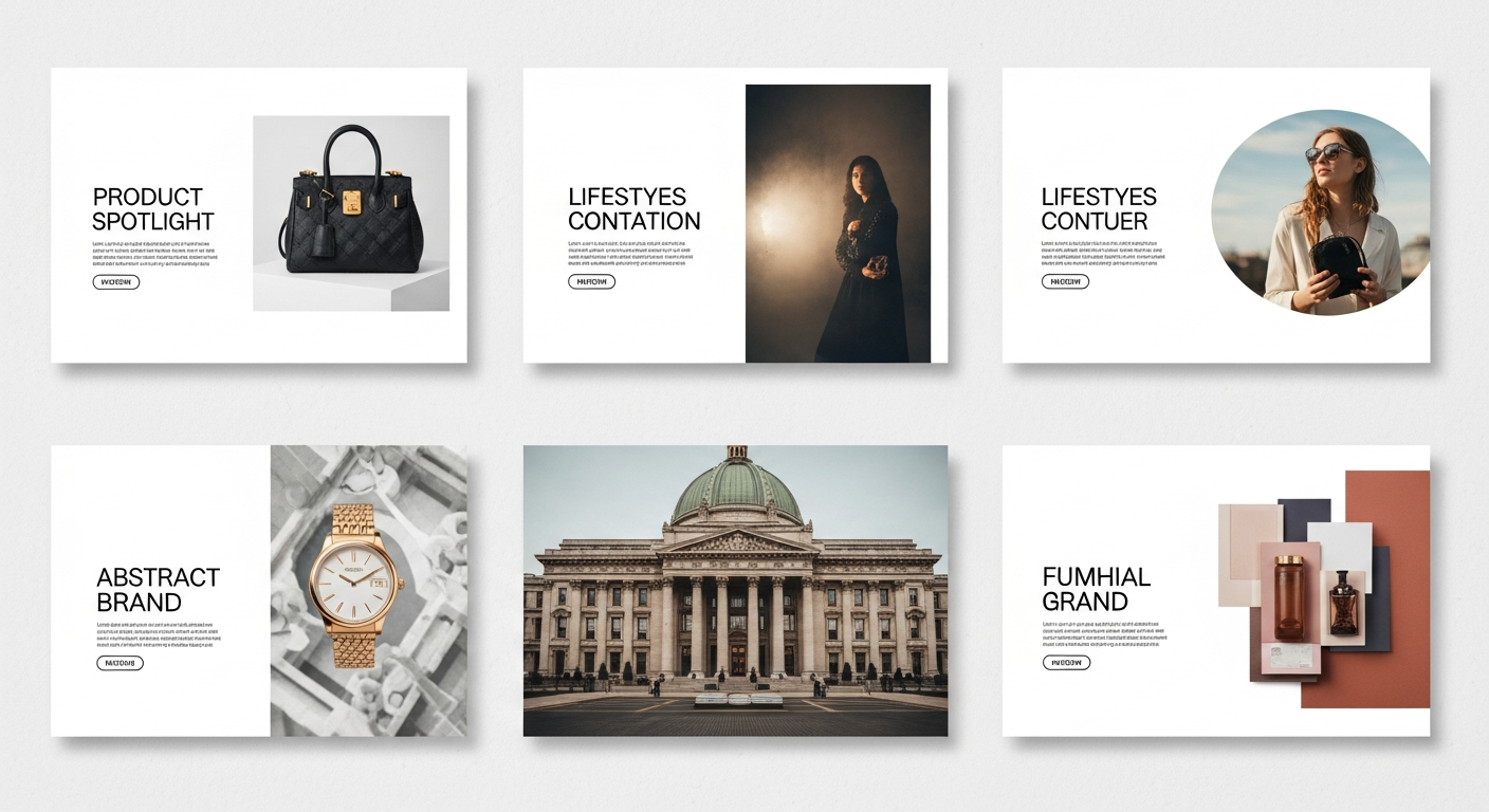
Fashion and luxury presentations are just as much about the brand experience as they are about the information. The design must reflect the brand’s style and taste.
- Make big, high-resolution images the main part of the design.
- Use a lot of white space to make it look exclusive and classy.
- Choose elegant serif or refined sans-serif fonts that match the brand’s style.
- Keep the text short and let the pictures tell the story.
- Make sure that every slide follows the brand’s color rules.
In high-end presentations, every pixel says something about the brand. Design is not just decoration; it is a way to talk to people.
4. Real Estate
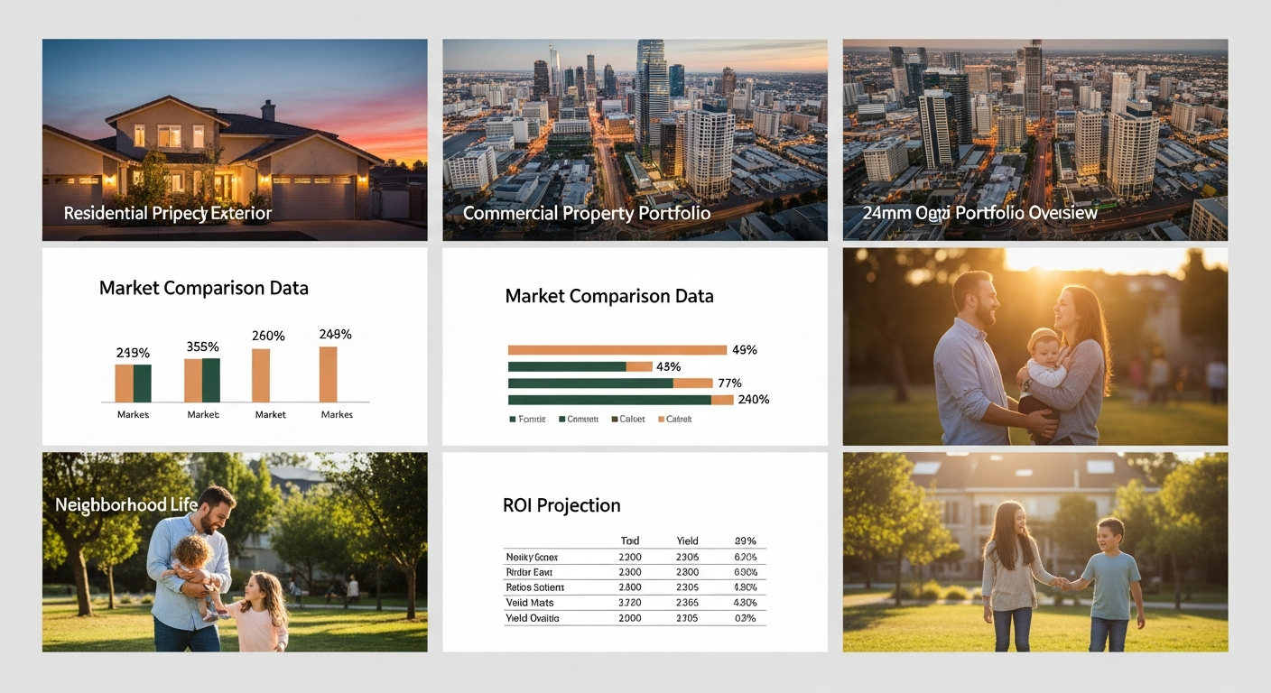
Presentations about real estate need to make people feel confident and want to buy. The deck must make the opportunity feel real and interesting, whether you’re selling a residential development or a portfolio of commercial properties.
- Start with good pictures of the property and maps of the area.
- Use charts and tables to show ROI projections, yield analysis, and comparisons between markets.
- Use pictures of neighborhood life to make an emotional connection.
- Don’t put too many numbers on data slides; make sure they are easy to read.
- Choose a professional color scheme of warm neutrals, deep greens, or classy grays.
Before any formal conversation starts, the goal is to help your audience picture ownership, investment value, or occupancy.
5. FMCG & Retail
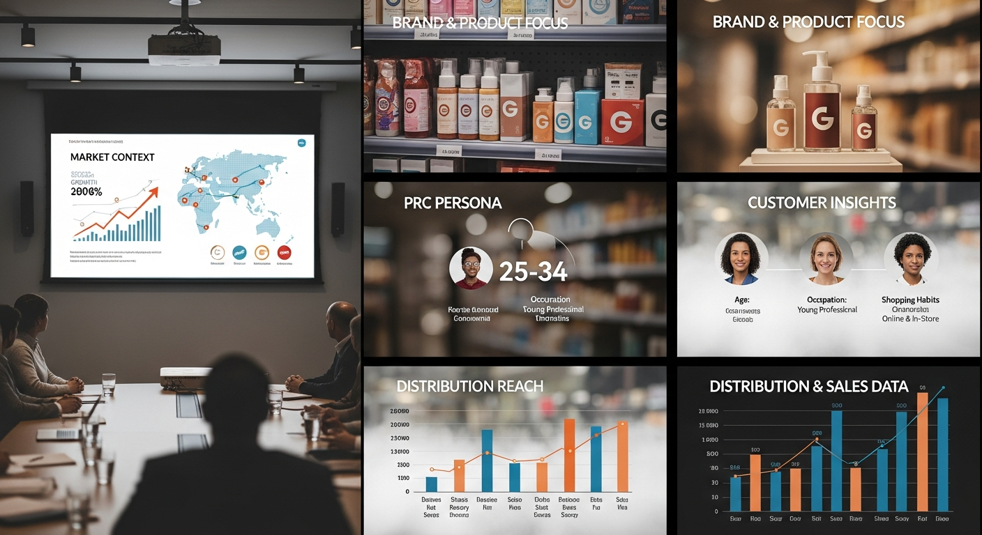
Presentations for fast-moving consumer goods must be lively, focused on the customer, and smart from a business point of view. Brand and retail teams want to know exactly how customers act and how the market works.
- Start with the market context, like the size of the category, how it’s growing, and who the competitors are.
- Use bold images and product photos that are consistent with your brand.
- Use research callouts, personas, or infographic summaries to show what you know about customers.
- Use charts that compare to show distribution, shelf presence, and sales speed.
- Finish with a summary slide that focuses on business and lists the next steps.
Presentations for FMCG move quickly. Make sure the story is tight and the data can be used.
6. Automobile
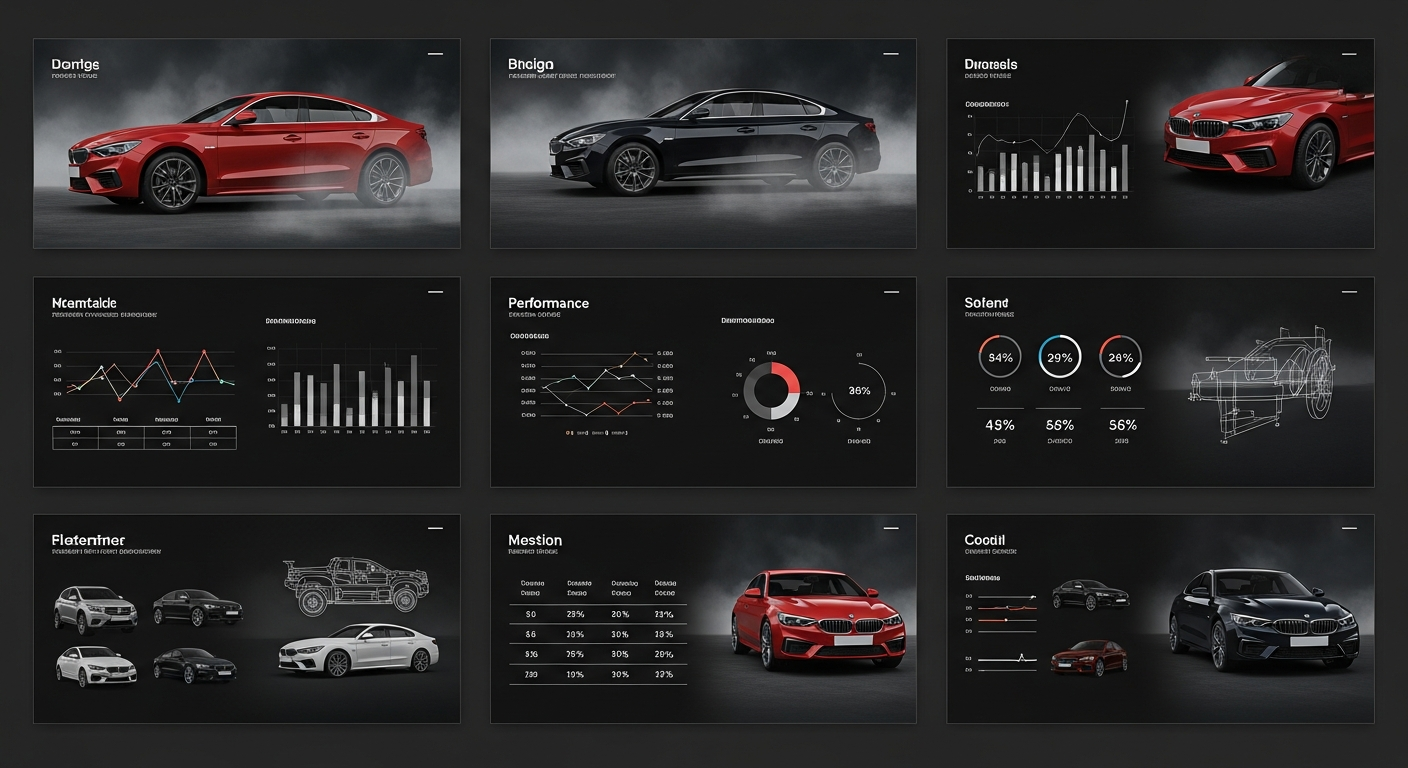
Automotive presentations mix technical accuracy with stories that make you want to do better. The visual language must meet the high standards of the industry, whether it’s for a new model launch, a dealer performance review, or an update on the supply chain.
- Use layouts that are sleek and dark, like those used in car design.
- Include high-quality photos of the product and close-ups of it
- Show performance data with dynamic charts and tables that let you compare them.
- When you talk about technical specifications, use engineering diagrams to help.
- Make sure the design language matches the brand tier, whether it’s premium or mass-market.
7. Sustainable and Green Energy
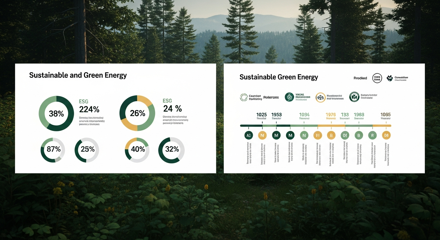
Presentations about sustainability need to be clear, based on data, and visually in line with the values they stand for. People in this field are becoming more knowledgeable and less likely to believe in greenwashing.
- Use colors that are inspired by nature, like forest greens, sky blues, and earthy neutrals.
- Use clearly labeled infographics to show ESG metrics and impact data.
- Use timeline graphics to show how far you’ve come toward your sustainability goals.
- Don’t use language that is too promotional; let data that is based on facts make the case.
- Include certifications, partnerships, and validations from outside sources.
Every Industry Has a Story. We Design the Slides That Tell It.
From Technology to Luxury, Healthcare to Real Estate, our industry-specific presentation solutions are built to match your audience’s expectations and exceed them.
Universal Design Principles That Apply to All Fields
No matter what field you’re in, the following rules are the foundation of every great presentation:
- Clear storytelling: Each slide should have a clear, single purpose in the story as a whole.
- Visual hierarchy: Use size, weight, and contrast on purpose to guide the viewer’s eye.
- Integrity of data: Never give up accuracy for looks. Charts should be clear and honest about what they say.
- Brand consistency means that the fonts, colors, and images you use should all match your business’s identity.
- Conciseness: Don’t use twenty words when ten will do.
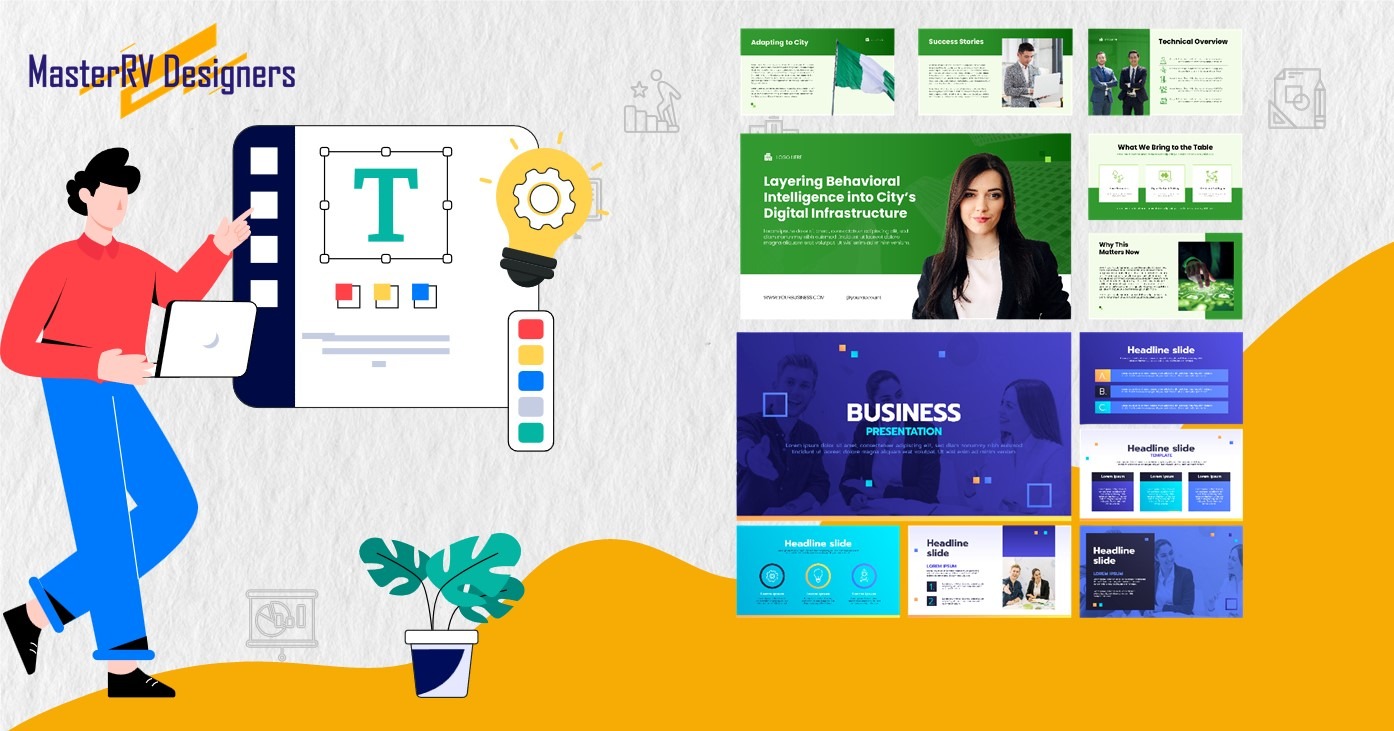
How MasterRV Designers Works on Projects in the Industry
The first step in our process is discovery. Before we make even one slide, we spend time learning about your industry, your audience, and what you want to say. We look over your brand guidelines, existing materials, and get in touch with your internal stakeholders.
Then, our team of senior presentation designers creates a visual framework that is unique to your industry and meets the aesthetic needs of your audience as well as the strategic goals of your business.
We have delivered over 1.3 million slides in fields such as technology, healthcare, fashion, real estate, logistics, and more. This means that we have a lot of experience and knowledge in each of these areas.
Final Thought
One thing that can make or break a presentation is how well it speaks the language of its audience. Design that is specific to an industry is not a small thing. It is a strategic choice that shows you know your field, respect your audience, and are dedicated to communicating clearly and with a purpose.
Every design choice has a purpose, from the data-heavy dashboards of a tech pitch to the immersive images of a luxury brand deck. Color, typeface, layout, and data visualization all work together to show that you know what you’re talking about, gain your audience’s trust, and help them make a choice.
We at MasterRV Designers think that the best way to design a presentation is to combine strategic thinking with visual craftsmanship. We’ve worked with over 16,000 clients in fourteen different industries, and one thing has always been true: when the design is right for the audience, the message has a much bigger effect.
Investing in design that fits your industry is worth it every time your slides are shown on screen, whether you’re getting ready for a big investor meeting, a global product launch, or a regular quarterly review.
Ready to Transform Your Next Presentation?
Work with MasterRV Designers to make presentations that are tailored to your industry, audience, and goals. We are ready to deliver excellence with quick turnaround, ISO-certified security, and a team of expert designers.
FAQs
Why should the design of presentations be different for each industry?
Every field has its own way of seeing things, what people expect from it, and how to talk to people. People who work in finance expect accuracy and restraint, while people who work in fashion respond to bold images and elegant type. By tailoring your presentation to these expectations, you show that you know what you’re talking about, build immediate credibility, and make sure that your message gets through to the right people in the room. A generic template, no matter how well-made, often shows that the person using it doesn’t know what’s going on.
How do I know which style of design is best for my business?
To begin, learn about the communication standards in your field. Look at the decks of your competitors, the materials from industry conferences, and the visual identity of the top companies in your field. Think about what colors, layouts, and data formats are always the same. If you’re not sure, working with a professional presentation design agency like MasterRV Designers will make sure that your deck is based on a lot of experience in different industries and good design sense.
If I change the content, can I use the same base template in different industries?
A strong base template can help keep things consistent, but changes to the content on the surface are usually not enough. To really align with the industry, you need to change the colors, fonts, images, choices for data visualization, and even how many slides there are. For example, a healthcare presentation needs a different layout and visual weight than a luxury fashion deck. Instead of using one adapted template for all sectors, we suggest creating separate visual frameworks for each one.
How important is it to use data visualization in presentations for specific industries?
Data visualization is very important in almost every field, but the types and levels of complexity of the visuals are very different. People in technology and finance expect to see detailed charts, dashboards, and analytics that compare things. Maps and yield tables are very important in real estate. In fashion and luxury, data should be shown in a way that is simple and elegant, like callout statistics instead of dense graphs. The most important rule is that your audience should be able to understand every data visual right away without any extra explanation.
What are the most common mistakes people make when designing presentations for a specific industry?
Some of the most common mistakes we see are using a generic corporate template that doesn’t fit the industry, putting too much text on slides when images would work better, using stock images that don’t fit the brand or industry, not matching the color palette to what the audience expects, and presenting data without enough context or labels. A structured design process that starts with audience and sector analysis before any visual choices are made can solve all of these problems.
How long does it usually take to make a good presentation for a specific industry?
The time it takes depends on how complicated the content is, how many slides there are, and how much custom illustration or data visualization is needed. Standard presentations at MasterRV Designers usually take 24 to 48 hours to get to you. Timelines get longer for more complicated projects that involve motion graphics, custom infographics, or multiple versions of regional decks. We work closely with clients to set realistic deadlines and provide dedicated support for urgent needs, such as delivery on weekends and holidays.